If the block’s presence or absence doesn’t change anything — remove it. There are various reasons for redundancy, but it's always good to check if a piece of text needs to exist on a page.
Data should create a proper context for the user to make a decision. If vital information is omitted from a certain step, the user would have to rely on remembering it from the previous steps or going back to double check.
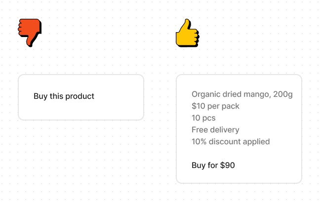
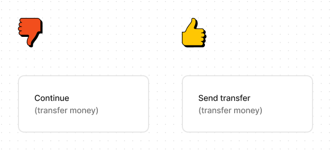
The user needs to be able to understand what happens next. So make it very clear, what to expect when clicking the button.
If you're introducing new words in the UI, don't change them from screen to screen. It's confusing when a previously established term is referred by a different word.

Focus on conveying points that help the user to make a decision about something. Don't be abstract and unmeasurable.
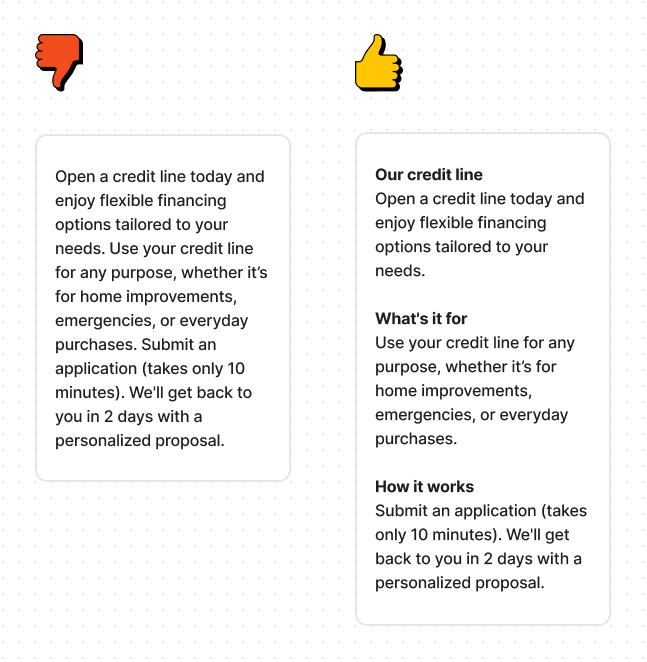
A featureless wall of text is hard to read. Create your sections in a way that each of them is aimed at answering a certain question, relevant to the user at this point.
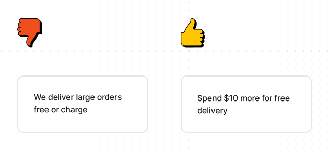
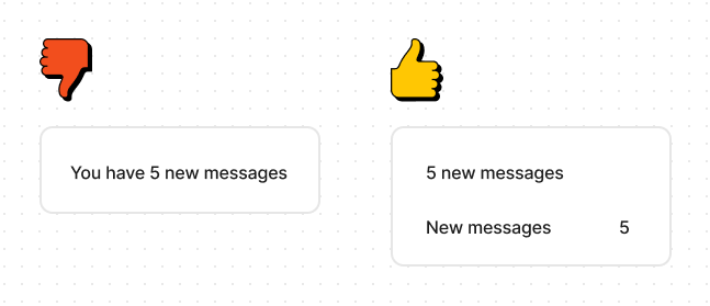
Start with variables, where possible. Users will learn what to expect from a certain block, so don't waste their time making them read the supplementary text every time instead of the actual information.
Select what is appropriate and keep it consistent.

Select one rule and stick to it. Use Camel Case In The App. Or don't use camel case. But regardless of that, be consistent. Otherwise it looks unprofessional and confusing.
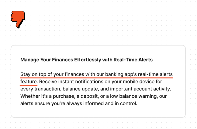
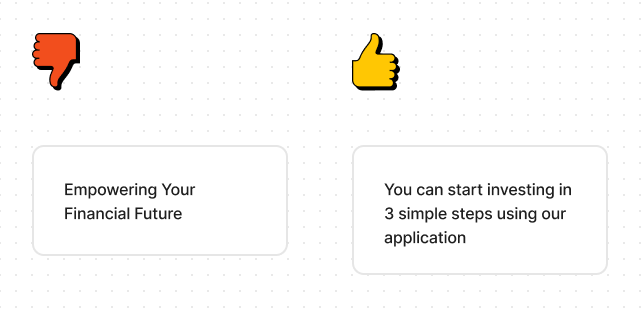
Just lay down the text in simple words, no matter how clunky it looks. You'd be surprised how much meaning is lost when a designer pursues a catchy phrase rather than a thoughtful explanation. Imagine you're telling the core idea of a text block to a friend. Then write it down.
Or, better yet, ask your client to describe it to you. If they are passionate about their product they often produce pure gems when speaking about it, rather than when they try to put it in writing.
After it’s done and approved, you can approach creating something that sounds nicer, but doesn’t lose it’s core meaning.